Blog

Read more about our projects

(… and how we work)

Slowly diving into Physics and Mathematics

, by Frank Hellenkamp

I was always interested in science and especially in physics for almost as long as I can remember. And I always used to read articles and a lot of books about it.


But I always strayed away from going into the mathematics of it. But that has changed since last autumn.


I started reading a lot of physics books, that not just describe things in terms of text descriptions but also in mathematical formulas.

And I am slowly getting a teeny-tiny glimpse of the depth, the mathematical reasoning and the connection(s) between mathematics and our physical reality.

It is only a very first small step – but I get a deep satisfaction from learning and thinking about it.


The interesting thing for me is, that the impulse for me to do it, is the same one, that motivates me to design or to write code:

Aesthetics — The deep feeling of a connection to beauty and (by all complexity) to simplicity.
PSI Mobile Prototype and Styleguide

, by Frank Hellenkamp

Angular Prototype

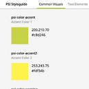
For some years we consult PSI together with Hesse Design regarding their styles for graphical user interfaces. The classical PSI applications are based on Java, that have a PSI specific styling.

But in the future many more of the application will move to mobile user clients and to webbrowsers, so we had to update the styleguide for the touch and mobile use cases.

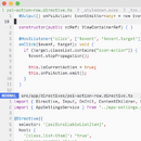
To help with the design we developed a new mobile prototype (based on Angular), that works for mobile applications and is also accessible on desktop and tablet user clients, that is optimized for touch:

Alony Relaunch

, by Frank Hellenkamp

Finally!

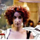
It was a long time coming and we relaunched the Website of singer Efrat Alony:

ScriptDock sets Sail

, by Frank Hellenkamp

ScriptDock is a social network for screenwriters.

The dig­i­tal age is tak­ing nar­ra­tive cul­ture to the next level. Script­Dock of­fers screen­writ­ers an chance to col­lec­tive tackle com­mon ob­sta­cles. 


In or­der to tap into the di­ver­sity of ideas and well de­vel­oped scripts, script­Dock is ded­i­cated to con­nect­ing writ­ers and in­dus­try mem­bers. 


ScriptDock offers a haven for screenwriters to present themselves, collaborate, network, and to market their work.

best architects award relaunch

, by Frank Hellenkamp

The best architects award is one of the most prestigious distinctions for architecture

So it needs a website with a design that is easy, open and does not get in the way of the works that get presented.


Architecture front and center!

Launching dsv-europa.de

, by Frank Hellenkamp

The umbrella asso­ci­a­tions of the Ger­man Social Insur­ance (DSV) have come together because of their com­mon Euro­pean pol­icy inter­ests to form the “Ger­man Social Insur­ance – Work­ing Group Europe e.V.”


We had the honor to implement their website and to service and administer it with our content management system.

Using and enhancing (almost) the same development environment for years

, by Frank Hellenkamp

VIM for winners

I was surprised when I started my old PowerBook G4 (still on the Mac OS X Tiger) and realised for how long I use (not the same) but a very similar setup for my development environment:


  • Mac OS X (now MacOS) plus Linux for Hosting and Services
  • QuickSilver (now OpenSource)
  • tmux (and before screen) and of course
  • vim

I basically still use OS X with a similar file structure (I always transferred all data to new machines).

depage-forms: validation of html5 forms (Part II)

, by Frank Hellenkamp

Validation of HTML form data

Thanks to the new HTML Standard and the WHATWG Group it is easier than before to have Browsers show standard errors when a user does not provide valid data inside an input element. Unfortunately this only works in newer Browsers, and not in older ones (e.g. Internet Explorer 8). 


To make it easier for developers, depage-forms provides an way easy way to add validation to forms that works in all three different places at the same time: 

  • on the server
  • in the browser, based on the new html standard
  • in the browser, based on javascript

Standard Input Elements

Getting things done without getting the word out

, by Frank Hellenkamp

Work

It has been a very long time since I managed to publish an article here. And it's not because there wouldn't be anything to talk about. But we are working a lot, so there is no time left to show and tell. Why? Well, because there is always a next project waiting to be finished.  


And I am sure, we are not the only ones having this problem: A lot of freelance designers and small agencies I know don't have the time or resources, to publish what they are doing regulary. Some people just shout on Twitter or on Facebook instead, but I have to admit: I like not to brag. But I think that some of the things we do are worth seeing nontheless. 


I already wanted to write about this... more than year ago. 

But this has to change – Starting right now! 

So, what were we working on?

So first, there is Screen-Pitch: 

The Ideas Preserver

, by Frank Hellenkamp

How to save your ideas from getting lost.

Zinnobergruen designed the excellent notebook "Ideas Preserver" for Chromolux. You can order it now on ideenkonserve.de and its free of charge! 

We implemented the website and its powered by the upcoming version of depage-cms and the new depage-forms


There are six wunderful categories for your ideas: 

  • Revolutionary Ideas
  • Profitable Ideas
  • Epic Ideas
  • Green Ideas
  • Enlightening Ideas
  • Little Ideas

The Idea Preserver 

Revolutionary Ideas 

Profitable Ideas 

Epic Ideas 

Green Ideas 

Enlightening Ideas 

Little Ideas 

depage-forms: html5 forms made easy (Part I)

, by Frank Hellenkamp / Sebastian Reinhold

HTML forms: Easy and difficult at the same time

HTML-Forms are simple to write – but to do it in a good way and to make them comfortable to use is not an easy task. 

There are a few things you will have to do again and again: 

  • Write the HTML for the form itself
  • Style the form in the right way
  • Validate the data in the browser (optional)
  • Validate the data on the server (never optional - don't forget!)
  • Additionally make sure the user don't have to fight with the browser e.g. strange messages about "resending" data on reloading the page and using back- and forward-buttons.

Forget about fighting!

black on white: uebele.com

, by Frank Hellenkamp

büro uebele gets its web presence with depage::cms

The web presence of Stuttgart based büro uebele has been implemented in depage::cms. The design of the website stayed almost the same. Concept and design by Andreas Uebele and Tristan Schmitz. 

But we optimized the technical implementation: 

lot's of free space for text

, by Frank Hellenkamp

Because text needs love:

textfreiraum.de is online! 


textfreiraum is a editorial agency, that takes the liberty to write articles, features and commentary independently as possible. We were invited to design their new internet appearance. Because textfreiraum lives and breathes through text, we had to find a layout that leaves a lot of space for the various texts. 

The content: Essays about Design

Recursive CSS

, by Frank Hellenkamp

Cascading Stylesheets and Recursion

In my rather sparse spare time I like to test various ideas and concepts upon which I stumble during my work. One of these ideas is applying Stylesheets in a way that creates graphical structures and patterns, that you would normally implement recursively in a full blown programming language. 


This works, because in CSS (Cascading!) every element inherits properties from its parent and because relative and absolute positioned elements calculate their positions based on the next relative or absolute positioned parent. 

(There is also a live-view for the examples available: http://sandbox.depage.net/css-recursion/ — but you'll need a modern browser to see some of the examples.) 

iPhone optimization and »mobile web«

, by Frank Hellenkamp

mobile internet

Similar to the development in the nineties, when the internet became more and more important due to the spread of PC`s, mobile access to the internet is now coming to the fore. Even though Apple`s iPhone only enjoys a relatively small share of the market, it does -along with Google`s Android- dominate mobile internet traffic.  

This is because the iPhone and Android achieve a fairly good display of regular internet sites that are not optimized for mobile internet thanks to Webkit. That is not the case with a lot of other browsers. 

depage.net displayed on the iphone 

Because the iPhone is currently the most important and best known mobile device we have decided to optimize depage.net and depagecms.net for display on the iPhone.  

depage blogged

, by Frank Hellenkamp

Our depage blog is online — with news and interior views of our projects. You are also most welcome to subscribe to Atom-Feed, so that we can always keep you updated. 

depage::cms goes opensource

, by Frank Hellenkamp

This year the official decision has finally been made: We will publish the coming depage::cms version under an opensource license, thereby making it available to a wider base of users and developers. 


Because this process will take some time (documentation, source code management on the basis of git, etc.) we must ask you to bear with us. If you are interested and would like to be informed about new developments, you can register for our newsletter and we will keep you up to date. 


You are welcome to fork us at GitHub. 

Always the same.

, by Frank Hellenkamp

Reading? On the internet?

We read an awful lot of things on our computer displays: emails, news, blogs, encyclopedias. But literature on the internet is still being treated with neglect (although there have been some attempts in this direction). 


The sites that are moderately successful often belong to the fan-fiction genre that is generally not taken serious by the established cultural scene. As far as its literal value is concerned this may be spot on, as a social phenomenon though it should be taken more seriously. 


»Die Zeit« recently complained in a dossier that not enough people read and that reader competence is dwindling. According to »Die Zeit« even books by Astrid Lindgren have to be simplified so that they can be read in certain schools. 


One can take this seriously or one can rubbish it as exaggerated and a form of cultural war that has always been fought in some way. Alternatively one could just do what might be the most pragmatic and sensible thing: Read and write, develop ones language skills and ideally have a positive influence on others. 

It's always the same.

immerdasgleiche.de is my own modest attempt to get people to take their time, to pause for a moment and to read and reflect upon “real language”, not only information that is easily digested. 


The texts: most of them short (I call them »shorties«), some of them of medium length (e.g. »Das Hospiz«). 


The layout: As simple as possible, black and white with a discrete navigation, completely scalable and with special print style sheets so that the texts can be printed out comfortably. 


Some specific online features: 

alony // lights on/off video

, by Frank Hellenkamp

For the same band, that we already had the privilege to do the packaging for, we have now created a video. The video is based entirely on photo material and on the illustrations that were already used for the booklet. The animation was implemented in flash and then exported as a video. 

The starting sequence

Alony Lights On/Off Startsequenz

The beginning of the video on the basis of the cover for dismantling dreams 

The video starts with a 16:9 variation of the cover photo of the album. Then the illustrated dream elements come to life, a white surface replaces the “real” background and the “protagonist” of the video sets foot in the dreamworld:  

She has some encounters with other characters (a neighbour, a man who is giving a child a good telling-off, a few camels, Oscar's tin drum, the love of her life whom she has to leave behind with a heavy heart, ...). On the way she falls over a few times until she finally learns to fly. 

Pop-Up-The-Bathroom

, by Frank Hellenkamp

10 trends in bathroom design

Pop-Up-The-Bathroom was about visualizing 10 trends in bathroom design. This project was developed in connection with the ISH on behalf  

of the VDS in collaboration with FAR_consulting, Karsten Jipp and Verena Landgraf

Verena Landgraf had illustrated the 10 Badtrends using individual pictures. Based on this illustrations, we had to design and implement interactive application for the internet with a different view for automatic presentation at the ISA. 

In order to give more space to these illustrations based on 2 dimensions, we decided to convert these spaces into »quasi« — a kind of — 3D. 

Because of the shortage of time it would not have been possible to use a proper 3D implementation, and what is more it would have destroyed the two dimensional character of these illustration. 


The following trends were illustrated: 

The implementation

alony // dismantling dreams

, by Frank Hellenkamp

Songs and Soundscapes

I had the privilege to design the cover and booklet of alony's new album Dismantling Dreams. 

The jazz band Alony is Efrat Alony (voice), Mark Reinke (piano, electronics) und Christian Thome (drums, electronics).  

At first we planned the booklet as a »little book«. 

Originally the booklet to the CD was conceived as a small book which — parallel to the music — was meant to take the listener on a small journey to another world (Dismantling Dreams). The listener should experience the music on several levels. Each song was the basis of a different level. 


Each level should be experienced as a new space which forms the framework of an individual »narrative«. The booklet was a stepping stone to an optical and haptic experience. Therefore it was important to us that the booklet was something you could touch and sense and could be perceived as a real object which you can hold in your hand or place in front of you. 


There are two reasons why this is important to us: 

Every Day is Exactly the Same.

, by Frank Hellenkamp

We live in a box.

Or better — we are living in a number of boxes. Small and big, open and closed, some of them have holes, others are dark like in a »maulswurfshügel«. 

One of these boxes is my computer. It has a small hole through which one can see the world — it is something people call the world wide web — but when you think about it, it is just a number of other boxes you look into. 

My box.

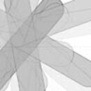
Everydayisexactlythesame.net is an attempt to visualize my own box. Every five minutes a screenshot is automatically taken. And at the end of the day an average picture is computed for the respective day. 


Here an example for the average picture of January 1st, 2009 — a day I was busy with Flash (animation) and engrossed in several websites but still found the time for a game of The World of Goo


Graphically, it would not get you very far if you just took an average picture — all you would have is a rather vague grey — that is why several versions of the same picture are calculated: