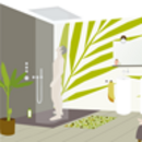
Pop-Up-The-Bathroom
, by Frank Hellenkamp10 trends in bathroom design
Pop-Up-The-Bathroom was about visualizing 10 trends in bathroom design. This project was developed in connection with the ISH on behalf
of the VDS in collaboration with FAR_consulting, Karsten Jipp and Verena Landgraf.
Verena Landgraf had illustrated the 10 Badtrends using individual pictures. Based on this illustrations, we had to design and implement interactive application for the internet with a different view for automatic presentation at the ISA.
In order to give more space to these illustrations based on 2 dimensions, we decided to convert these spaces into »quasi« — a kind of — 3D.
Because of the shortage of time it would not have been possible to use a proper 3D implementation, and what is more it would have destroyed the two dimensional character of these illustration.
The following trends were illustrated:
- Soft Bathroom
- Green Bathroom
- Fashion Bathroom
- Easy Bathroom
- Design for a better bath
- Private Spa
- Water Love
- Homing
- Techness
- Interior Concepts
The implementation
The conversion was achieved via flash, namely through single tweens. For each room there is a tween between frame 2 and frame 100. The position between the tween (X-position) and the zoom factor (Y-position) is determined via the position of the mouse.
Behind the respective objects there are interactive areas which with one click produce a pop-up with additional information.
In addition to the selection of the interactive surface »onMouseOver«, a short animation is shown for all objects that can trigger a popup so that the user is given a hint as to where the surface is positioned. This hint is kept short and should only be noticed intuitively, not consciously.
A selection of rooms
Easy Bathroom:
Green Bathroom:
Designer:
Automatic execution
To enable an automatic execution for the presentation at an exhibition we had to implement a presentation tool that could load all rooms successively and could select all interactive surfaces of the room individually. At the same time the movement that the user normally executes with a mouse is simulated.
We also integrated a pause function in the presentation player that could fade in a freeze image when required, which would blend in with the background at the trade-show booth.
The website
The website consists of fairly extensive texts regarding the respective badtrends. As many internet users prefer not to read long texts on screen, the page was designed in such a way that it can be printed out in an optimized way.
As flash objects are normally not printed using HTML based content, these are replaced by an image of the original illustration on print. On devices where the user has no flash at his disposal — take iPhone.as an example — the same placeholder images are shown instead of the flash objects.
The page is in two languages.


