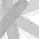
Recursive CSS
, by Frank HellenkampCascading Stylesheets and Recursion
In my rather sparse spare time I like to test various ideas and concepts upon which I stumble during my work. One of these ideas is applying Stylesheets in a way that creates graphical structures and patterns, that you would normally implement recursively in a full blown programming language.
This works, because in CSS (Cascading!) every element inherits properties from its parent and because relative and absolute positioned elements calculate their positions based on the next relative or absolute positioned parent.

(There is also a live-view for the examples available: http://sandbox.depage.net/css-recursion/ — but you'll need a modern browser to see some of the examples.)
The basic Markup
The basic markup is very simple. You have a viewport and simple nested divs inside. The reason, why we use divs is simple: Divs don't have any properties in HTML other than being block-elements.
In this example we have a recursion depth of 5 (the following example images all have a depth of 18):
<div class="viewport test">
    <!-- {{{ children with recursion depth of 5 -->
    <div>
        <div>
            <div>
                <div>
                    <div>
                    </div>
                </div>
            </div>
        </div>
    </div>
    <!-- }}} -->
</div>
And now the basic stylesheet for the viewport:
Everything not within its borders will be hidden (overflow: hidden).
.viewport {
    position: relative;
    background-color: #ffffff;
    width: 61em;
    height: 61em;
    margin: 1em;
    overflow: hidden;
}
The second instruction (.viewport div div) is important:
Every div inside a div will have a lower opacity, so that we'll get a sense for infinity (recursion without a break condition) and we'll see elements lying over one another.
.viewport div div {
    opacity: 0.9;
}
The first basic example: »Third«
In the first basic example, every box is one third less wide than the parent box (width: 66.66666%).

.third div {
    position: relative;
    top: 0;
    left: 0;
    border-right-width: 1px;
    border-right-style: solid;
    border-color: #000000;
    width: 66.6666%;
    height: 100%;
}
.third div:hover {
    border-color: #ff0000;
}
To make it more clear: »Staircase«
This is a staircase, where I put numbers into the boxes showing their depth. Every box is 5em x 5em in size and also moved 5em to the right and 5em to the bottom:

.staircase div {
    position: relative;
    top: 5em;
    left: 5em;
    border-width: 1px;
    border-style: solid;
    border-color: #000000;
    width: 5em;
    height: 5em;
}
.staircase div:hover {
    border-color: #ff0000;
}
Let's rotate it: »Rotation«

.rotation div {
    position: relative;
    top: 50%;
    left: 45%;
    border-width: 1px;
    border-style: solid;
    border-color: #000000;
    background: #dddddd;
    width: 5em;
    height: 5em;
    -webkit-transform: rotate(-50deg);
    -moz-transform: rotate(-50deg);
    -o-transform: rotate(-50deg);
    transform: rotate(-50deg);
}
.rotation div div {
    top: 5em;
    left: 5em;
}
.rotation div:hover {
    border-color: #ff0000;
}
Effects: »Rotation 2«

.rotation2 div {
    position: relative;
    top: 50%;
    left: -10%;
    border-width: 1px;
    border-style: solid;
    border-color: #000000;
    background: #dddddd;
    width: 72em;
    height: 12em;
    -webkit-transform: rotate(-50deg);
    -moz-transform: rotate(-50deg);
    -o-transform: rotate(-50deg);
    transform: rotate(-50deg);
    -webkit-border-radius: 6em;
    -moz-border-radius: 6em;
    -o-border-radius: 6em;
    border-radius: 6em;
}
.rotation2 div div {
    top: 5em;
    left: 5em;
}
.rotation2 div:hover {
    border-color: #ff0000;
}
The last example: »Rotation 3«

.rotation3 div {
    position: relative;
    top: 50%;
    left: -10%;
    border-width: 1px;
    border-style: solid;
    border-color: #000000;
    background: #dddddd;
    width: 72em;
    height: 2em;
    -webkit-transform: rotate(-50deg);
    -moz-transform: rotate(-50deg);
    -o-transform: rotate(-50deg);
    transform: rotate(-50deg);
    -webkit-border-radius: 6em;
    -moz-border-radius: 6em;
    -o-border-radius: 6em;
    border-radius: 6em;
}
.rotation3 div div {
    top: 5em;
    left: 5em;
}
.rotation3 div:hover {
    border-color: #ff0000;
}
Conclusion
Basically useless at this point ;-) — but it proves how flexible CSS is and what kind of effects we are able to get with some simple styling instructions.
If we would combine it with other CSS transformations and CSS transitions it could be much more interesting.
But we will leave this for a later time...