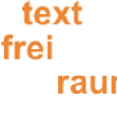
lot's of free space for text
, by Frank HellenkampBecause text needs love:
textfreiraum.de is online!
textfreiraum is a editorial agency, that takes the liberty to write articles, features and commentary independently as possible. We were invited to design their new internet appearance. Because textfreiraum lives and breathes through text, we had to find a layout that leaves a lot of space for the various texts.
The content: Essays about Design
Textually textfreiraum consists of three basic topics:
- A Blog with news about design,
- »Design and Living«, with articles and essays about product and interior design
- »Designer's Voice«, a series of interviews which are worth reading with designers like Philippe Starck, Johanna Grawunder or Ross Lovegrove.
The Layout
The Layout is based on movable logoparts: »text« (text), »frei« (free) and »raum« (space). These sit on a huge plane of white space. There are four differerent variations of the logo.

Variations of the logo
The underlying grid of text colums is designed to match appropiately:
The editors are able to freely choose the layouts for their content. Additionaly the layouts are exchangeable without the need to change the content of a page, because every layout consists of two columns (a main column and a smaller margin column).
But it gets particulary interesting when we start to combine various layout variants on one page — that way we easily get dashing combinations.

Three different layout variants (1, 4 und 3) with dummy text
Because there are many pages with lots of text which span over several screen pages, we automatically duplicate the logo on these longer pages, so the sender is always visible. These duplicates are in a more subtle gray than the first orange logo version.
We purposely kept the main navigation very simple — it consists of only one level: We list the subitems on the index-pages instead. Additionally you can navigate between blog-entries by using the previous-next-navigation on the right side of every entry.
Hyphenation
Good Hyphenation on web-pages is more or less non-existent up to now. Theoretically, one could add soft hyphens to the text, that are only visible if the text breaks at that specific place.
Unfortunately the soft hyphen (­ or ­) is not universally supported by — especially older — browsers, so you could see the soft hyphens like normal hyphens. So we are not able to use soft hyphens in practice.
But there is a solution for this — introducing: hyphenator.js
hyphenator is an opensource library written by Mathias Nater, which implements client-side hyphenation directly in Javascript. And it's very easy to use — just embed the hyphenator-script for your language into your html-code:
<!-- for german -->
<script type="text/javascript"
    src="path-to/hyphenator_de.js"></script>
To generate the javascript-files for specific languages, there is also a very convenient tool available: hyphenator.googlecode.com/svn/trunk/mergeAndPack.html
It allows you to configure the language(s), that should be included, to change the selector what to hyphenate and to set various other options. By default all the text inside of HTML-elements with the class »hyphenate« will be hyphenated. In this case we activated it for all textboxes, but not for the navigation, the main headlines or the teasers.
<div class="size-L hyphenate">
    <h2>Als Journalisten lieben wir Worte. </h2>
    <p>Als Design-Fans stehen wir aber auch
        auf das sinnliche Konzept aus Optik, ... </p>
</div>
Optimization for mobile devices
We opimized textfreiraum for mobile devices like the iPhone or Android-phones in addition to the default view. We did this in a similiar way to depage.net.


And now: Have a good time on textfreiraum.de!


